Fly Financials
The role I filled for this project was all inclusive. I researched, wrote, and designed all aspects of the app in Figma.
Target Audience
The target audience for this project are teenagers to young adults that are looking to get a better understanding of their financials. While this is certainly not an exclusive list, any one of any age can use this app, the design has been based primarily around these two demographics.

Research study details
In my initial research I decided to focus my competitive audit on two companies that had already established themselves in the field. Robinhood is an indirect competitor whose audience falls in line with the teenager to young adult demographic. While their primary purpose is in investing they have dedicated a lot of effort into creating an appealing platform that is intuitive to use. Mint on the other hand is a direct competitor, while they are essentially trying to fill the same market space I believe that they miss the mark with some of their design choices, that can actually make the app more difficult to use.

The Goal:
The goal for this project was to take what I have learned so far and combine it into a Desktop and Mobile app. The idea that I settled on is to create a financial literacy app geared towards teens and young adults.


Key challenges
The key challenges for this project stemmed from trying to build a design that worked as both a mobile app and a desktop app. In order to accomplish this I decided to take the mobile first approach. I did this because the mobile app was more space constrictive. So as I was building the mobile app I could write down ideas that I had that would fit better on the desktop screen. For example, having different items displayed on the desktop that wouldn't fit on the mobile screen.


Initial design and wireframes
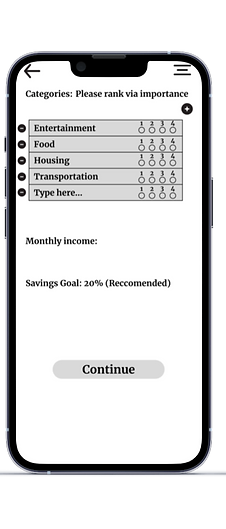


Results from User testing
After the initial round of user testing people expressed the desire to have more accessibility features present on the home screen. To accommodate this I added a hamburger style menu to the desktop version, and added a dropdown menu on the phone version. Users also expressed a desire to have more personalized information, such as being able to add and subtract from the categories section.
Final polished designs
.png)
M.png)


Conclusion
Each project I complete I learn a little bit more about both design and Figma. Budgeting out my time so that I could complete both the desktop and mobile version was certainly the most challenging aspect of this project. I am happy with my decision to take the mobile first approach as well because it allowed me to synthesize better ideas for the desktop version, while still sticking to the constraints of the mobile app.
